
How Printed Display Boxes Boost Retail Sales
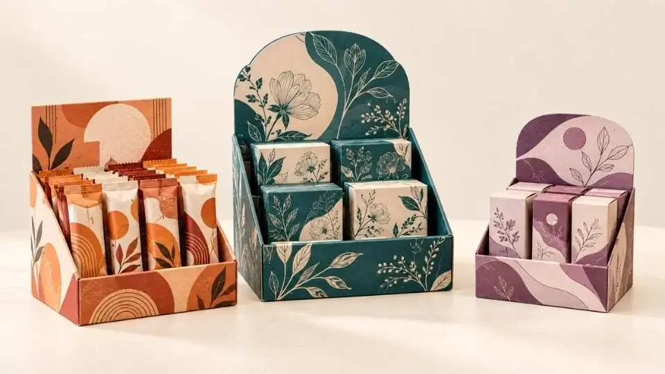
A product behind plain packaging is a product that relies 100% on customers knowing what it is. Most customers don't. They scan, they compare, they take in what they see first – and they forget the rest. That's where printed display boxes come into play. They placed the brand, the product and the selling message in the path of the customer before the first employee, before every visit to the website, before any action to get closer.
In the retail environment where time is short and time on shelf is limited, a printed display box is not a packaging option. It's a visibility strategy. It offers an understanding of the role that construction of a display box, print specification and choice of finish play in achieving retail visibility, and how the difference between a display box that sells and one that just occupies shelf space can be achieved. The difference is on the sales velocity, and that is where it shows up before anywhere else.
What a Printed Display Box Actually Does on a Shelf
Printed Display Boxes are a type of packaging that has been used to showcase product at the point of sale. It brings the stability of the retail ready structure (stable base, strong product image, clearly marked front panel and consistent shelf bay footprint) plus high cover print with the brand and product name, and principal claims and visual hierarchy the customer needs to make the purchase decision.
A printed display box is designed to be viewed, as opposed to a generic tuck-end carton or a plain brown box. It maintains the product held so that it is at the proper angle, orientation and position on the shelf. And every time, in every unit, whether it's been thoughtfully placed by a staff member or passed by a customer.
Display boxes provide structural consistency at the shelf that's the first step towards retail visibility. That consistency is no coincidence. It's purposefully designed into the die cut line, board specification, and the print registration from the outset.
Construction Type Determines Shelf Presence Before Print Is Applied
In order to make one color visible, the condition is set by the construction of a display box before the color goes down. A counter display with a tear-away front panel brings product to eye level on the checkout counter where dwell time is long, and competition is high.
The case becomes the display with several units face forward in a bay, with no staff handling the individual products required for the shelf display. A header card display is a branded panel that is elevated above the product line, reaching into the upper space that traditional shelf packaging can't reach. A dump bin is a great way to drive high volume impulse sales as it makes the product look plentiful and easily available.
The visibility condition is unique for each type of construction and will vary depending on the environment in which the product is sold and how customers will navigate the space, as well as the feasibility of any employee involvement in that establishment. If the construction is incorrect, the best print in the world will be at the wrong angle, position, doing less than it could.
Print Coverage Tells the Brand Story Before the Customer Decides to Engage
The visibility of a display box is achieved when the customer sees full-coverage, high fidelity print on each and every panel of the display box. The front panel is adorned with the main brand logo, name, hero image or graphic, and the main claim.
Secondary messaging, supporting claims or range information is displayed on the side panels when approaching customers from the aisle. The brand mark is placed at a height and size appropriate for a header (where applicable) where it can be seen from across the room. Where brand accuracy is paramount, offset lithography on SBS board is the right print technique for the display boxes. Pantone colours remain true from unit to unit, fine text remains readable and product imagery remains as detailed as to bring a customer to the phone.
Although flexo printing is good for simpler two or three color designs at high volume, it may not be considered as a fine detail resolution method as is required in luxury and premium display boxes. The print is no mere ornamentation. It's what the box is talking to the Customer when you're not there.
Finish Choices Determine Whether a Display Box Reads as Premium or Ordinary
Two boxes of the same print can have very different meanings when displayed on a shelf depending only on finishes. Use matte laminate to add weight and seriousness to a display box. It works well for personal care, cosmetic and artisan food applications, as its matte surface is perceived as quality.
Gloss laminate is ideal for confectionery, children's products and seasonal displays, as it provides vibrancy and energy — the ideal choice for a brand message. The "soft-touch laminate" is a high-end tactile feel that the customer feels at the moment of picking up the box, which is a high-end quality signal especially suitable for beauty/lifestyle products.
Spot UV gives contrast to the logo or a graphic element that will help attract attention on a flat shelf of competitors. The logo's surface is different depending on the angle of the light, and the changes are not animated, but they attract the eye without changing colour. A display box that isn't thoughtfully finished is a display box that has left the view on the table. The finish is the last thing that can take a product from being considered to being made and shipped.
Structural Inserts and Windows Add a Second Layer of Visibility
Some print display boxes not only feature the outside aesthetics, but the product as well. A die-cut window on the front panel will allow the customer to view the actual product before purchasing it, which helps to minimize hesitation to purchase, and boosts conversion in categories where color, texture or size is a factor in the buying decision.
Products like cosmetics, nail polish, stationery and food products all take advantage of the window effect which means the product is visible to the customer without needing to open the box. Product is placed in structural inserts, which are positioned inside a display box, to ensure proper elevation and orientation for product placement in the window and to ensure proper readability through the display panel.
An invisible thermoformed or molded pulp insert that holds a bottle in perfect position within a display box gives the product a give-the-look-of-placed appearance, rather than rattling around inside a too large display box. There is more to the box's surface than the eyes can see. It's a matter of whether the whole presentation (box, insert and product) is a designed object that works together.
Retail-Ready Packaging Reduces Friction for the Retailer, Which Keeps the Display Intact
If a retail employee cannot identify the product and find it quickly in the display box, or if the product is going to be difficult to place, the product will not be well-served in the display. Display boxes are designed so that they can be used for retail display straight out of the shipping carton, or the display box folds up from a flat surface without tools or instructions.
The speed and simplicity is crucial as a slow setup box will result in an incorrect setup, and an incorrect setup box will have no visibility at all. Brands that make a mark in the retail environment are brands whose display packaging is effective for the retailer as well as for the end user.
These are the attributes that help keep a display looking right the entire selling cycle — and not just on the first day it's on the floor. Retailers know when a display brand makes their lives easier and that positive attitude will pay off when range reviews come time.
Consistent Branding Across a Range Multiplies Shelf Impact
One properly designed display box creates visibility for one product. Multiple identical-branded display boxes make a branded block that can be seen from a greater distance, has deeper shelf space for purpose and tells the shopper that the brand has a range of products, and that the shopper was interested in one product. Having a consistent colour palette, typography, logo placement and finish throughout a display span makes a section a brand moment.
People who know the brand in the distance are already primed to interact without reading a single word. The reorder consistency – the same board caliper, the same Pantone references, the same finish specification – is as important as the initial design choice and is what builds that recognition over time with consistent packaging. When the range is any shade off the black, it appears as if it doesn't have its product in one place, and no brand would want to send that message to the shelf.
Why The Packaging Tree Specifies Display Boxes From the Shelf Position Back
The Packaging Tree begins all projectings on packaging displays with the retail environment they will be entering. Before design begins, the construction will be determined by conditions such as shelf height, bay width, direction of customer traffic and retailer needs for shelf ready packaging. The next step is to select board caliper, print method, finish and insert specification in relation to one another and in relation to product and the retail environment.
Physical samples are required before the full production run, as there is no way to correct the visibility problem if a display box looks good on the screen and bad on the shelf once the run begins. The Packaging Tree creates display specifications which are consistent across multiple retail channels, while not sacrificing optimisation for one store and compromising on the others. Every production spec from the first run is consistent, as is the shelf presence in which the brand invests, upon replenishment.